Future Directions
Introduction
The current website explores many aspects of networks of Anglophone LGBTQ+ writers in exile. In future developments to the website, we would like to present new data, additional visualizations, and new features. Below we would like to showcase potential future directions for the website through mock-ups and short descriptions of our ideas. Here we aim to provide a glimpse of how the website could look in the near future. To introduce this potential work, we've divided this section into three parts:
I. Reorganizing the website
II. Introducing new functionalities
III. Presenting new visualizations
II. Introducing new functionalities
III. Presenting new visualizations
In the first part, we show how a new version of the website could organize the visualizations in a different way. While the current version gives a great overview of the data organized according to the movements and creative exchanges of exile writers, the visualizations could be integrated still further and made searchable in additional ways. The idea would be to organize the visualizations in ways that foster deeper engagement with the data, while maintaining the overall scope of the current website.
In the second part, we show how new functionalities could be used to display and communicate additional aspects of the data.
In the third part, we show how new visualizations could be designed to explore the database in greater depth.
In the second part, we show how new functionalities could be used to display and communicate additional aspects of the data.
In the third part, we show how new visualizations could be designed to explore the database in greater depth.
I. Reorganizing the website
Below you can see a potential new version of the whole website as it would be organized on the landing page and in three different blocks: “Scope of the study,” “By author,” and “By location.”
Landing Page
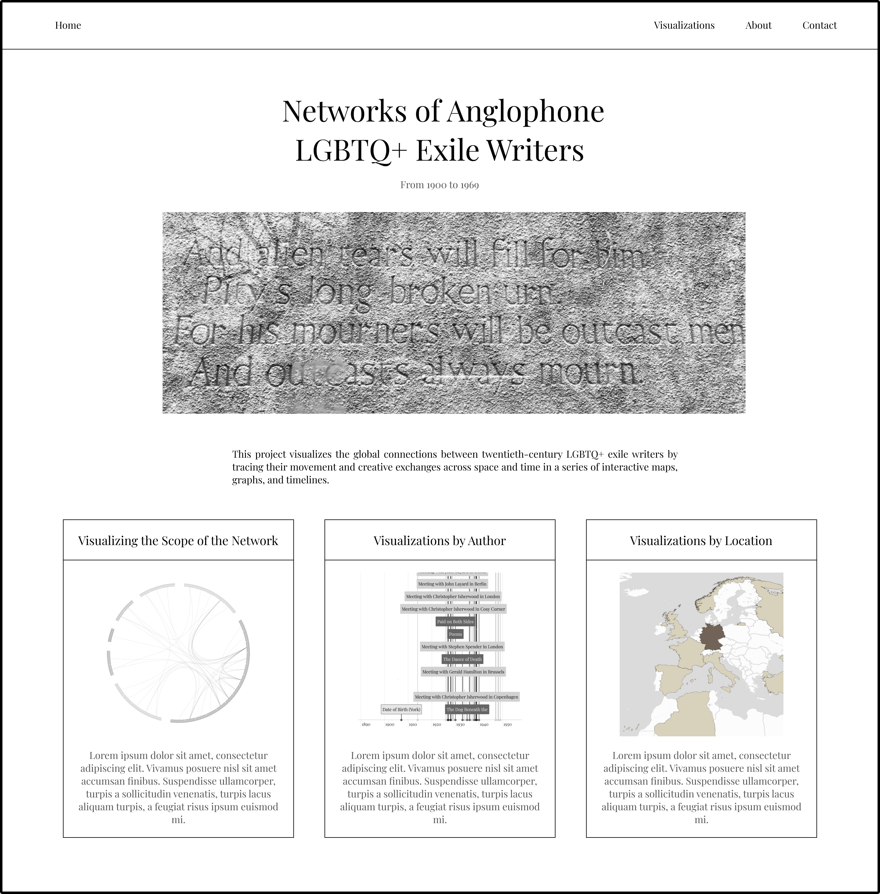
The landing page now lets you choose between three sections.
Block 1: Scope of the Network
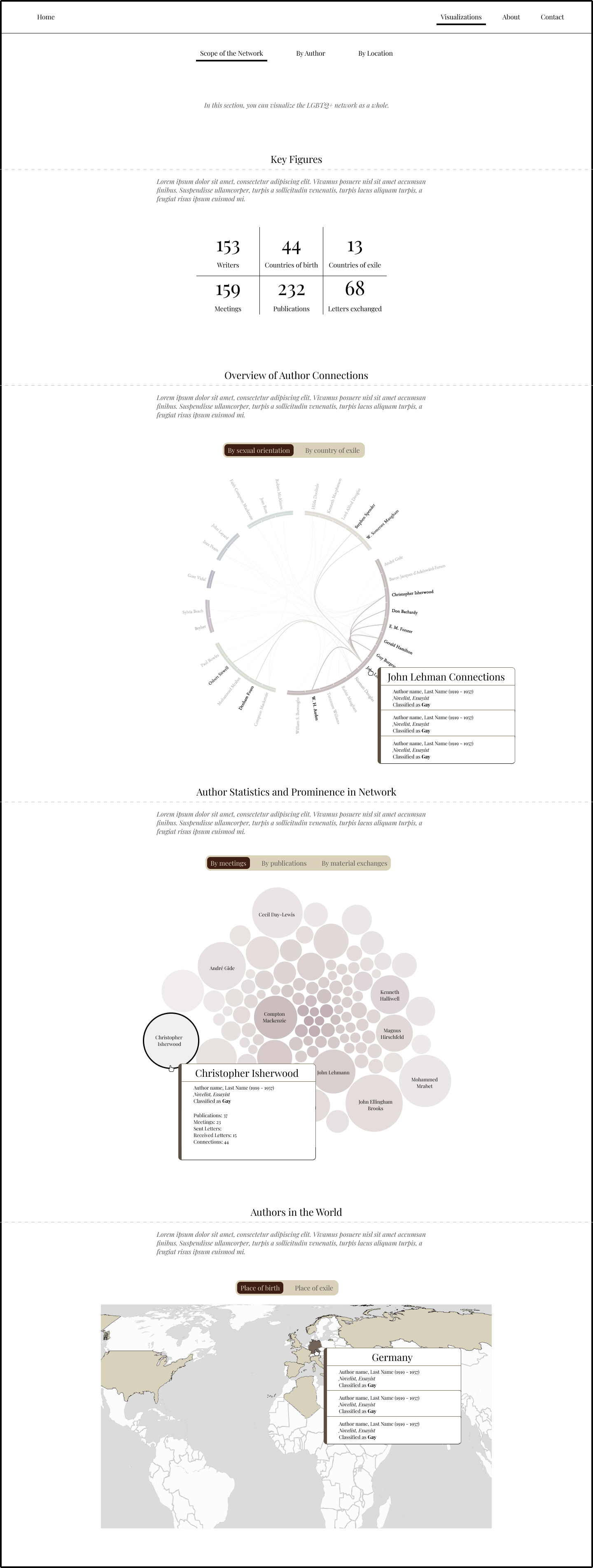
In this overview of the scope of the network, you have different views of the whole database and connections between authors. The idea is to give an overview of the contents of the data and how the authors will be represented.
Block 2: Visualizations by Author
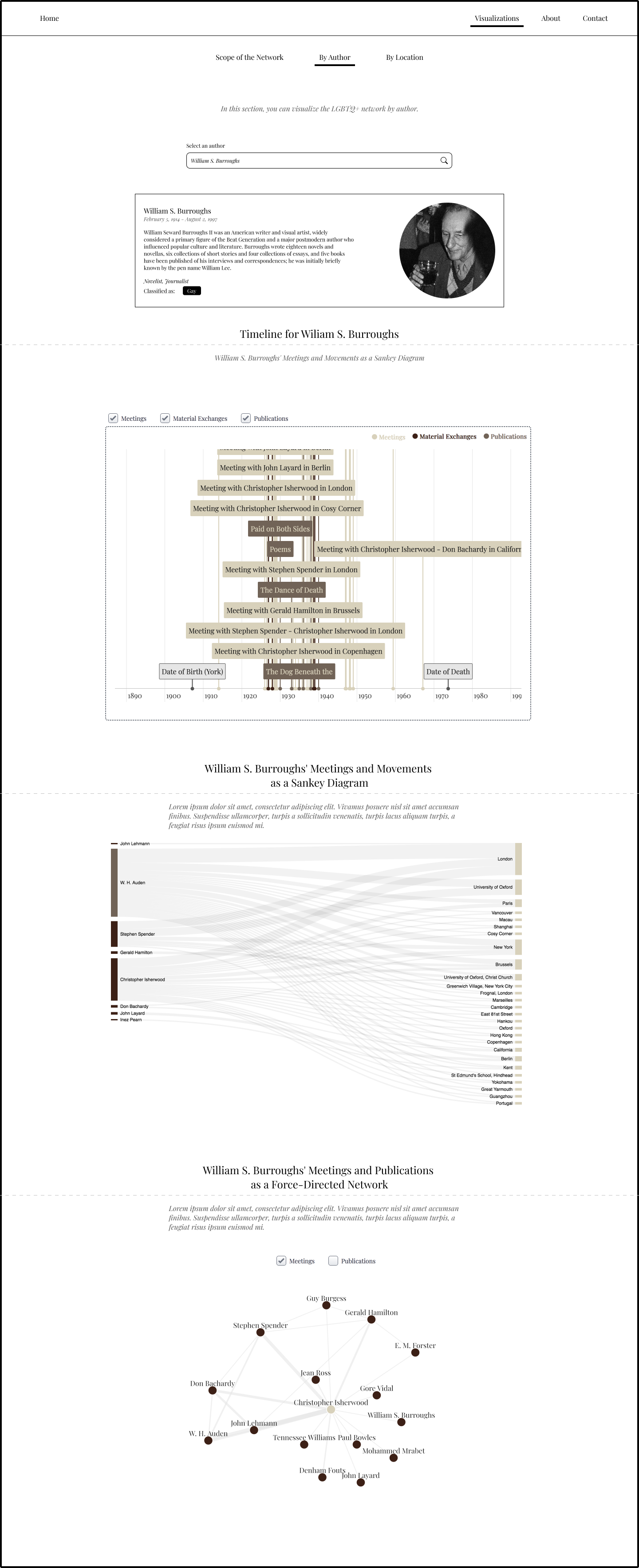
In this block, you can view different visualizations by author, including their biographies, their timelines, and their meetings and publications.
Block 3: Visualizations by Location
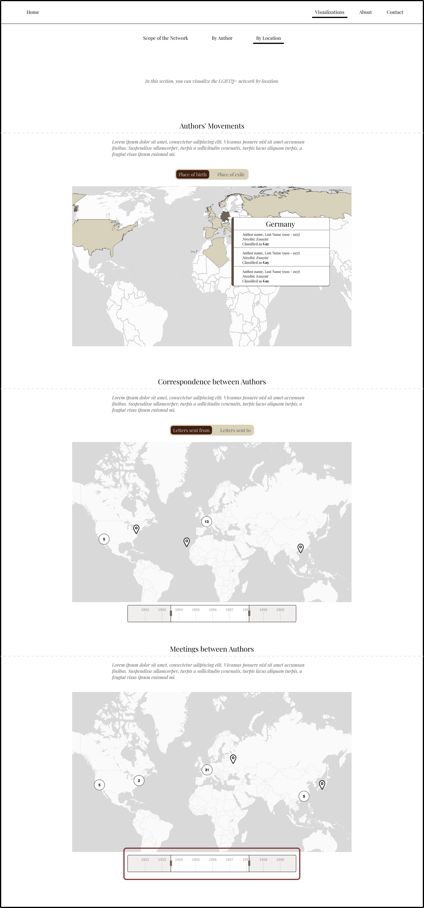
In this block, you have a spatial overview of the data, including places of birth, places of exile, meetings, and correspondence.
II. Introducing new functionalities
In this section, we present some new functionalities within the existing visualizations that could support further exploration of the data. These new functionalities would involve aggregating and making the data interactive in different ways. 

1. Different toggles across the application
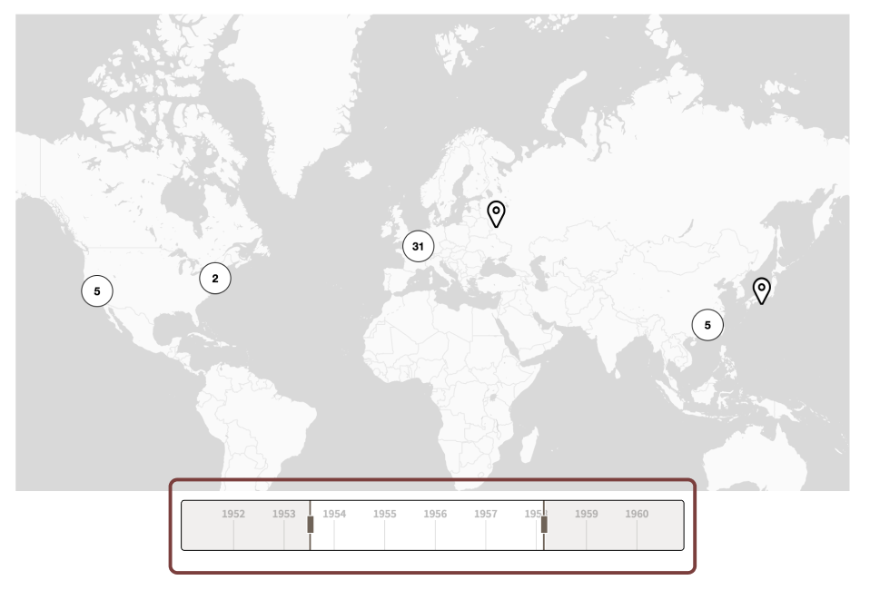
We could incorporate toggles to display different aspects of the data within existing visualizations. For example, a choropleth map could show the relative densities of “Places of birth” or “Places of exile” for all the authors in the database or the graphs could be organized according to sub-categories in the data (such as types of meeting). 2. Timeline filter on maps
For the “Map of Correspondence” and the “Map of Meetings,” we will add a timeline filter to select specific date ranges to see the evolution of the network. 3. Author biographies
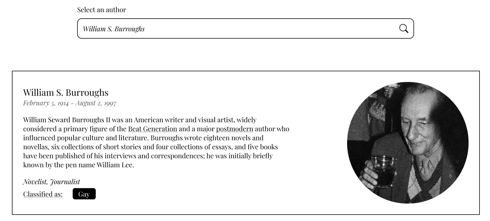
In the "By Author" section, we will enrich the data by providing extra information about the authors presented in the data, such as a short biography, an image of the author, and a list of their main publications. III. Presenting new visualizations
Additional visualizations will require organizing and aggregating the data in new ways. 
1. Key Metrics
An initial set of key metrics will present the general scope of the data. 2. A bilevel edge-bundling network visualization
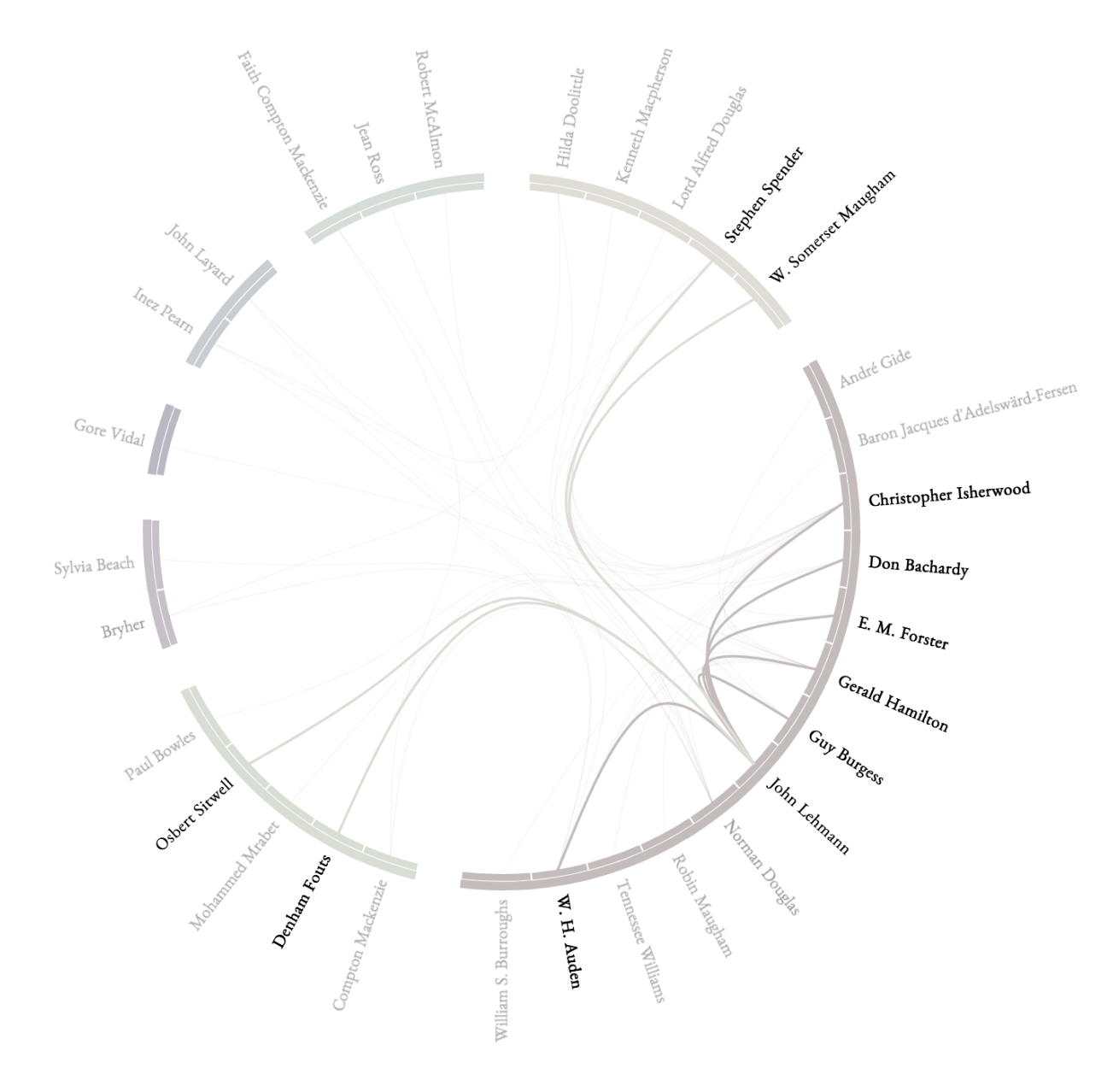
This visualization allows us to view all the connections in the dataset (organized by meetings or material exchanges). By moving the mouse over connections between authors, users will gain further insight into the network. This visualization will display the density of connections between different authors (or nodes). 3. A circle-packing visual
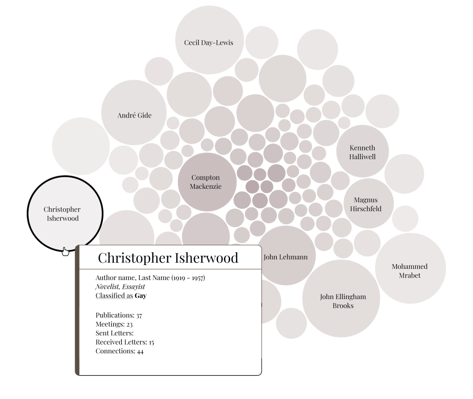
This visualization clearly communicates a specific metric (such as the total number of publications, meetings, or material exchanges) and the selected author’s prominence within the network in comparison with other authors. This tool quickly tells users who is represented in the database and gives an overview of the different data categories.